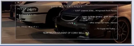
- :
- 09 370Z Nismo
Now this is something weird. I made this signature, and at home it appeared perfect in a 1024x768 res. Perfect look is as attached.
Now it appeared this way at home, but then at work it appears messed up, I had to take out a couple 'br /' spacings in the code to keep the text from going beyond my sig and into other people's posts. Then I also had to re-align the middle table picture to line up with the outer table picture, to make it appear as one image.
Now that I fixed it at work (still 1024x768), apparently my friends tell me it looks messed up on their comps, (same res). What the hell. I used pixels as the unit of spacing, I don't know how it could change on a different computer at all, even in different resolution. What could be changing?..... or it it, hmm navigator at work and internet explorer at home?

