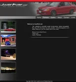
Here is a Jpg of the layout for my upcoming site. I just want some feedback from people, even if its a "Looks good". Any bit of negative or positive feedback would be great. The site is just going to be a portfolio type website for me.
The photos on the left, the second one down - it seems abnormally bright/color blown out than the other three...maybe it needs to be the first pic or maybe choose a different pic? Just draws the eye first and doesn't seem to go with the others.
ok, those will be changing weekly, or daily, or whenever I have new pics I want to post when the site is actually up so I'll keep that in mind, for brighter pics I may overlay a "smoke" layer over the thumbnail. Thank you
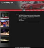
I would make the top nav a separate element (thin horizontal bar with different coloring to stand out), and highlight the current page. Something along the lines of this: